New Logo –
 While Facebook’s designers called this change to be “grown up and to be taken seriously”, the reactions from a few other designers were completely insane.
 Apart from the negatives, Facebook’s new logo was hugely appreciated.
Talking about logos, here’s something more interesting,
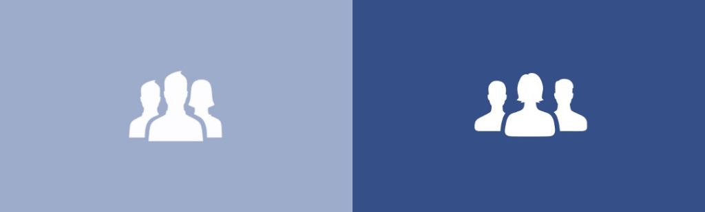
Facebook recently hired Caitlin Winner as their Design Manager and she found some of the logos quite upsetting.
For example,
1. The Friends icon had a Male icon overpowering the Female icon. The Male icon had a nice spiked hairdo, while the Female icon had a Death Vader-like helmet hairdo, which tempted her to mess around with the company glyph kit and make some changes in the logos.
Apart from the negatives, Facebook’s new logo was hugely appreciated.
Talking about logos, here’s something more interesting,
Facebook recently hired Caitlin Winner as their Design Manager and she found some of the logos quite upsetting.
For example,
1. The Friends icon had a Male icon overpowering the Female icon. The Male icon had a nice spiked hairdo, while the Female icon had a Death Vader-like helmet hairdo, which tempted her to mess around with the company glyph kit and make some changes in the logos.
 2. Also, the old ‘groups’ icon featured two men and one woman, the woman sat in the back, left behind the larger centered man. So yeah, Caitlin Winner tweaked the logo and placed the lady first.
 Well, these changes don’t mean you won’t get those spam-ish updates in your news feed or get you rid of those stalkers drooling over your profile pictures. But then again isn’t that the reason why social media is still relevant?]]>