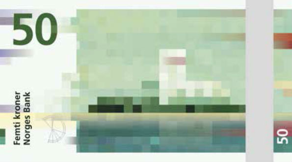
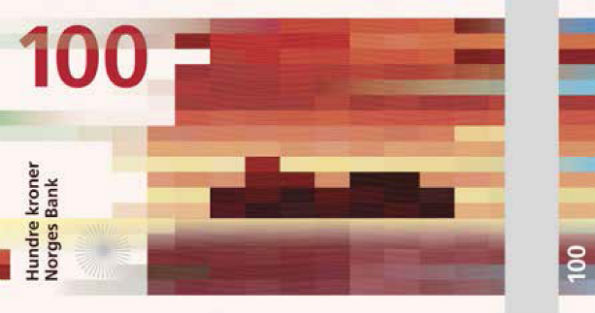

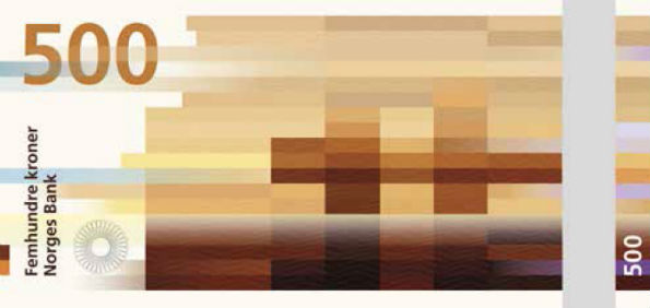
 Personally I loved the design. The design is no fluke. They are not random pixels placed on the note. If you haven’t cracked it yet, this is the concept behind it : The designers have used coastal landscapes & translated into color blocked visuals. But that isn’t the end of it. If you look at the 50 kroner note, the wind is weak and the image is created using short shapes and slowly the wind is getting stronger & for the 1000 kroner note, we see a longer & more compact bricks.
Higher resolution images are not available because of the security reasons. Well India, do you think we should have a different designed notes too?
Source : Snøhetta: Beauty of Boundaries]]>
Personally I loved the design. The design is no fluke. They are not random pixels placed on the note. If you haven’t cracked it yet, this is the concept behind it : The designers have used coastal landscapes & translated into color blocked visuals. But that isn’t the end of it. If you look at the 50 kroner note, the wind is weak and the image is created using short shapes and slowly the wind is getting stronger & for the 1000 kroner note, we see a longer & more compact bricks.
Higher resolution images are not available because of the security reasons. Well India, do you think we should have a different designed notes too?
Source : Snøhetta: Beauty of Boundaries]]>
Leave a Reply