Instagram took the world by storm, after it changed its logo out of the blue purple-slash-pink-slash-yellow. What’s more, it wrecked hearts exactly like a storm wrecks lives.
The old Instagram logo had come to be an icon, of sorts, for storytellers; photographers; selfie-takers; food-makers; bathroom-goers…you get the point.
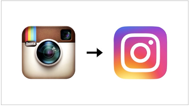
Even food had come to be shaped in the iconic logo for Instagram addicts.Another fine example of changes being made for absolutely no reason, there is quite literally nothing right about the new logo. In all honesty, it barely even looks like a camera. It just looks like a fairly uneventful mess of watercolors splashed inappropriately over a scrap of paper, which upon realisation of the fiasco, has been covered up in a feeble, child-like attempt with a white square that’s supposed to look like a camera.
It also looks like a scarily inaccurate attempt at making a logo with the colors of a galaxy, but using 50 wrong shades of galactic colors.
Come on, Instagram, get your shit colors together!