
Goodbye stereotypical notes. Haven’t you always wondered, what would the notes look like if not for Mahatma Gandhi’s face plastered all over it? Don’t get me wrong, I love Gandhi but a new layout won’t hurt. If nothing, it would be a good incentive for me to SAVE & not SPEND.
What inspired me to bring out this topic once again is the new note look launched by Norway’s Norges Bank. They hired two designers one for each side of the note to give their banknotes a new look and boy are they beautiful.  The Metric System’s design is responsible for the front & Snøhetta is responsible for the front.
And here’s how they look like:
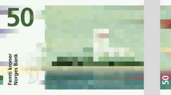
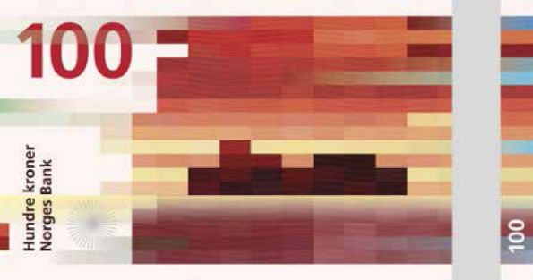
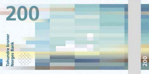
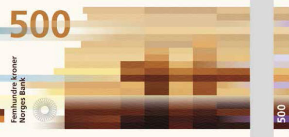
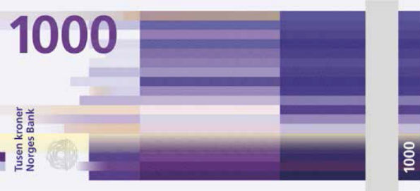
Personally I loved the design. The design is no fluke. They are not random pixels placed on the note. If you haven’t cracked it yet, this is the concept behind it : The designers have used coastal landscapes & translated into color blocked visuals. But that isn’t the end of it. If you look at the 50 kroner note, the wind is weak and the image is created using short shapes and slowly the wind is getting stronger & for the 1000 kroner note, we see a longer & more compact bricks.
Higher resolution images are not available because of the security reasons. Well India, do you think we should have a different designed notes too?
Source : Snøhetta: Beauty of Boundaries