With the gushing wave of all high-end brands raising their bar, Motorola is leaving no stone unturned. For those who possess butter fingers, Motorola brings to you Moto X Force, a phone that does not shatter when dropped. This is something really cool because they have covered up one of the most dreadful things that could happen to today’s generation.
The new introductory teaser shows some statistical features like 30% of broken screens never gets fixed or 40% people are deathly scared of their phones falling down, etc. A very interesting innovation in technical aspects, social media is flooded with tweets and updates since its announcement. Perhaps, it is quite relatable since we all have gone through this misery at least once.
A lot (Believe me, A LOT) of them are fired up for this new gadget since it will fix the fuss of many with its arrival. It has also attracted tweeple with its Hashtag #MotoFaceOff. Here is the link to the teaser.
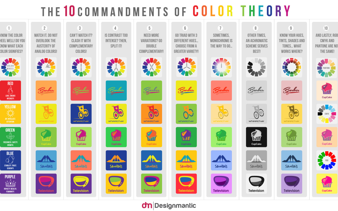
There’s something about color that completely amazes me. The effect they have on how we see things & how we perceive things. There’s been a lot that has been said on color theory but this one infographic summarizes pretty much everything, helping us save time & efforts.
This infographic by Designmatic has summed up 10 cardinal rules of color scheming and acts as a guide when it comes to choosing colors. Matching colors is not everybody’s cup of tea but one can always try. Here are the ten commandments :
1) Know the color wheel well. Every color signifies something. Know what it is.
2) Analog colors work too.
3) Complementary colors are your safest bet.
4) If you think contrast is too intense, split it with complementary.
5) Experiment with double complementary color scheme.
6) Three is not too much. Not unless you know how to use it.
7) Sometimes monochrome is just what you need.
8) When in doubt, go black & white
9) Get a sense of understanding of your hues, tints, shades & tones.
10) This one is my favorite : RGB, CMYK & Pantone are NOT the same.
Goodbye stereotypical notes. Haven’t you always wondered, what would the notes look like if not for Mahatma Gandhi’s face plastered all over it? Don’t get me wrong, I love Gandhi but a new layout won’t hurt. If nothing, it would be a good incentive for me to SAVE & not SPEND.
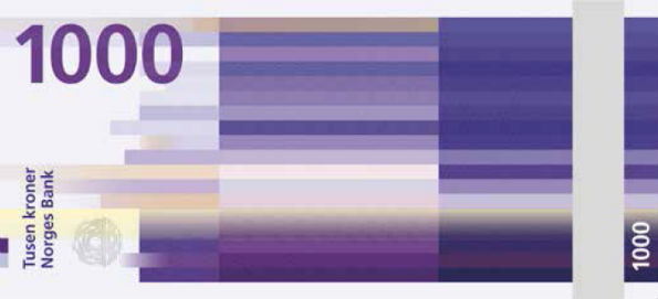
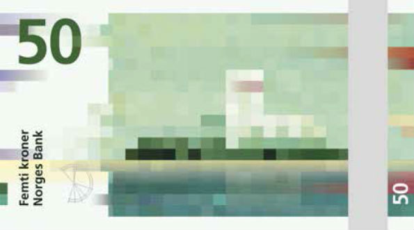
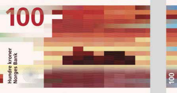
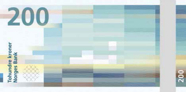
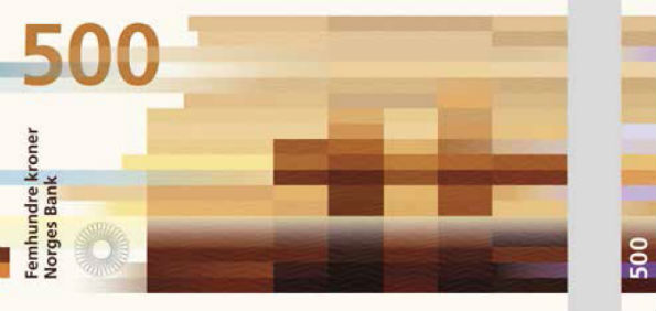
What inspired me to bring out this topic once again is the new note look launched by Norway’s Norges Bank. They hired two designers one for each side of the note to give their banknotes a new look and boy are they beautiful.  The Metric System’s design is responsible for the front & Snøhetta is responsible for the front.
And here’s how they look like:
Personally I loved the design. The design is no fluke. They are not random pixels placed on the note. If you haven’t cracked it yet, this is the concept behind it : The designers have used coastal landscapes & translated into color blocked visuals. But that isn’t the end of it. If you look at the 50 kroner note, the wind is weak and the image is created using short shapes and slowly the wind is getting stronger & for the 1000 kroner note, we see a longer & more compact bricks.
Higher resolution images are not available because of the security reasons. Well India, do you think we should have a different designed notes too?