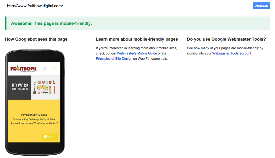
Ever wondered if your site has what it takes to make sure it ranks good or if it would qualify to be a good mobile friendly site in Google’s eyes? To put an end to all these endless questions, Google has introduced a new tool.
Here’s the link : https://www.google.com/webmasters/tools/mobile-friendly/?utm_source=wmc-blog&utm_medium=referral&utm_campaign=mobile-friendly
Get ready to get a Pass or a Fail certificate from Google. The two results that show up are :
Awesome! This page is mobile-friendly.
Not mobile-friendly
A few criterias on which Google evaluates your site is :
a. If your website has flash content
b. Readability of the text : Whether one can read the text without zooming in
c. Adaptiveness of the website onto your mobile.
d. Link placement is good enough for people to click on it with ease.
And we passed the test! *Woot Woot*
Read everything there is to know about it directly from the horse’s mouth : http://googlewebmastercentral.blogspot.in/2014/11/helping-users-find-mobile-friendly-pages.html
Very rarely does it happen that we end up watching a 3 and half minute video without checking on the timer on how many minutes are left. This one campaign by HE deodorant breaks all norms.
The anthem was launched digital and they plan to weave the entire 360 activity around it. The jingle very smartly & sarcastically brings in front of us the challenges that men face on a day to day basis and how they deserve some love.
We have been an ardent supporter of Men’s Day and we thought the campaign was brilliant. What do you think peeps?
Are you just as fascinated by this topic as we are?
Let us introduce you to the world of Dictionary of Obscure Sorrows. These guys have constantly invent new words and the word that explains this particular photographer’s frustration is Vemödalen. It is the fear that everything has already been done. It completely explains the frustration of photographing something amazing when thousands of identical photos already exist.
Ever since WhatsApp introduced “read receipts” in the form of two blue ticks, there has been a chaos in the chatting world. This was how your chatting partner knew if their messages were seen.
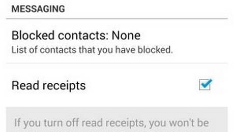
But this move was universally frowned upon and people were waiting for a fix. Well, it’s here people. You can now disable this fix through one simple step. The updated version 2.11.44 (only available on WhatsApp’s site for now) has a new option under privacy settings. You have to go the Whatsapp site to download for now.
If you check “Read Receipts”, it will enable you to turn it off or turn it on. There you go. Problem solved.
But all this buzz has got us thinking whether the fix was a genuine release after all the noise or all this was a PR plan just to re-create the hype around the app. What are your thoughts peeps?
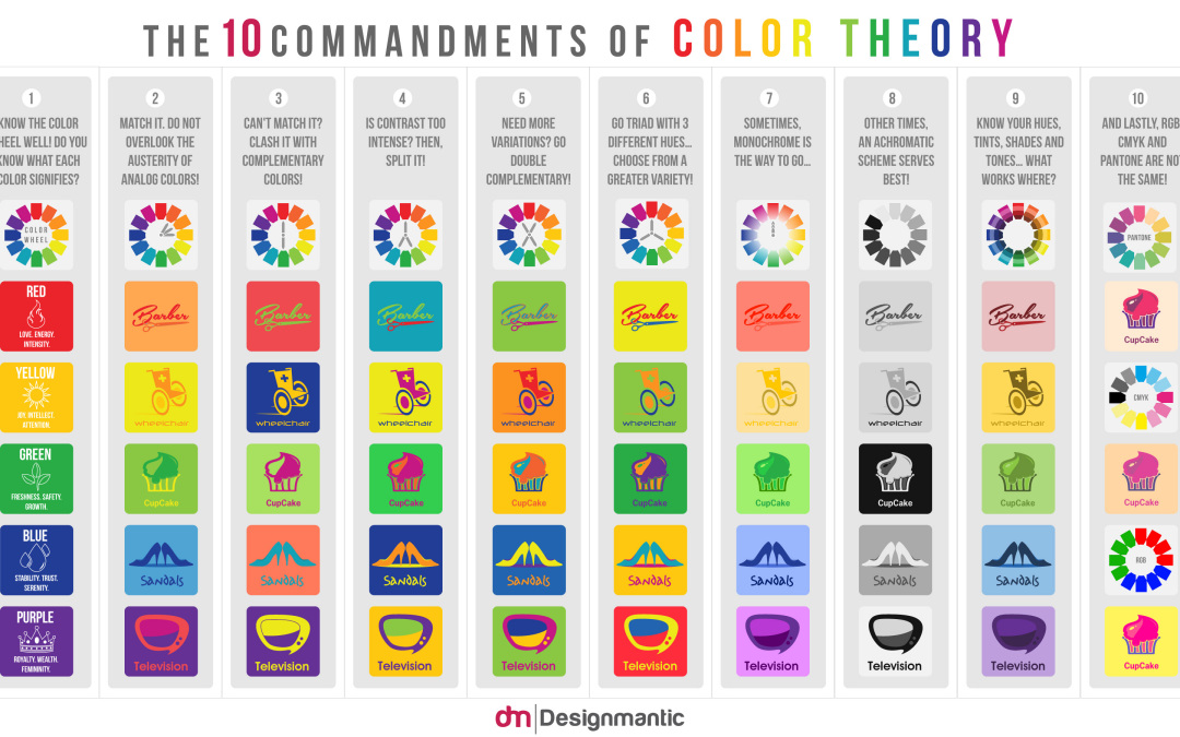
There’s something about color that completely amazes me. The effect they have on how we see things & how we perceive things. There’s been a lot that has been said on color theory but this one infographic summarizes pretty much everything, helping us save time & efforts.
This infographic by Designmatic has summed up 10 cardinal rules of color scheming and acts as a guide when it comes to choosing colors. Matching colors is not everybody’s cup of tea but one can always try. Here are the ten commandments :
1) Know the color wheel well. Every color signifies something. Know what it is.
2) Analog colors work too.
3) Complementary colors are your safest bet.
4) If you think contrast is too intense, split it with complementary.
5) Experiment with double complementary color scheme.
6) Three is not too much. Not unless you know how to use it.
7) Sometimes monochrome is just what you need.
8) When in doubt, go black & white
9) Get a sense of understanding of your hues, tints, shades & tones.
10) This one is my favorite : RGB, CMYK & Pantone are NOT the same.
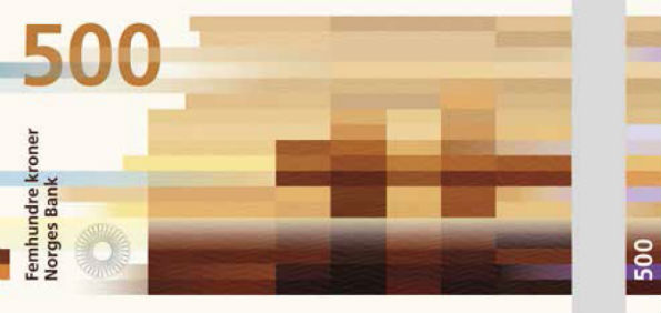
Goodbye stereotypical notes. Haven’t you always wondered, what would the notes look like if not for Mahatma Gandhi’s face plastered all over it? Don’t get me wrong, I love Gandhi but a new layout won’t hurt. If nothing, it would be a good incentive for me to SAVE & not SPEND.
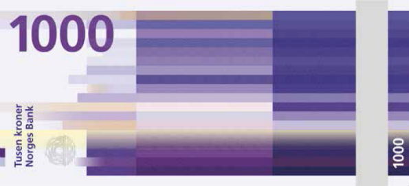
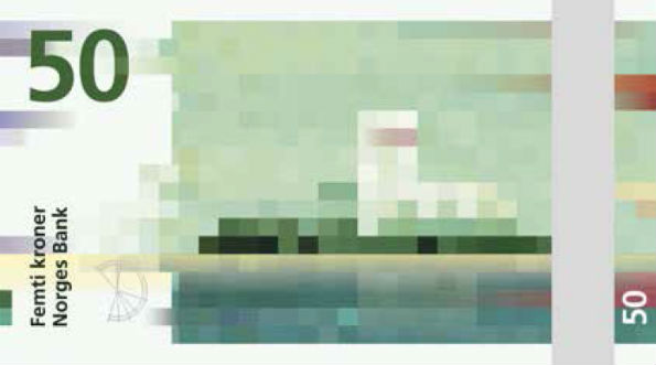
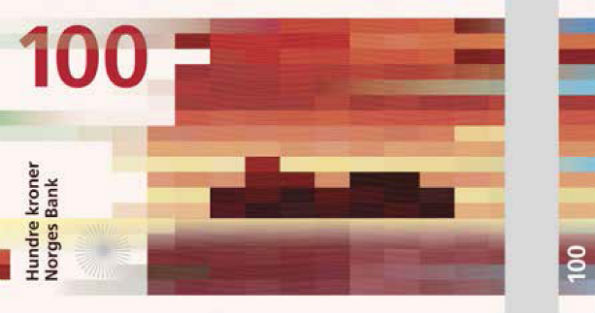
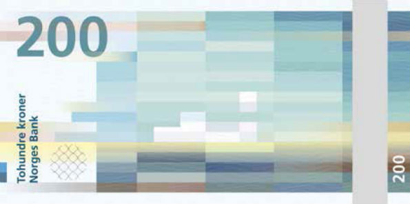
What inspired me to bring out this topic once again is the new note look launched by Norway’s Norges Bank. They hired two designers one for each side of the note to give their banknotes a new look and boy are they beautiful.  The Metric System’s design is responsible for the front & Snøhetta is responsible for the front.
And here’s how they look like:
Personally I loved the design. The design is no fluke. They are not random pixels placed on the note. If you haven’t cracked it yet, this is the concept behind it : The designers have used coastal landscapes & translated into color blocked visuals. But that isn’t the end of it. If you look at the 50 kroner note, the wind is weak and the image is created using short shapes and slowly the wind is getting stronger & for the 1000 kroner note, we see a longer & more compact bricks.
Higher resolution images are not available because of the security reasons. Well India, do you think we should have a different designed notes too?